
Role | Product Design, UX/UI Design, UX Research

Project |
Discussion Forum App for DIY Design and Home Improvement Enthusiasts
Moms and Pops is a DIY community based forum app, created for first time homeowners and DIY enthusiasts to connect with experts to answer questions, solve project challenges, and develop a knowledge base around homemaking and home improvement.
The DIY Community App was created to provide a centralized space for makers, hobbyists, and DIY enthusiasts to connect, share resources, and collaborate on projects. In a world where passion projects and hands-on crafting are on the rise, there was a clear need for a platform that could facilitate and nurture these communities. Our goal was simple: to design an app that not only connects users with resources and events but fosters a sense of belonging within the DIY world.
Product Discovery: Identifying the Need
Our journey began with the realization that DIY communities, though rich in creativity, often face disconnection. Whether they were looking for local events, inspiration for their next project, or collaborators, DIY enthusiasts were left bouncing between disparate platforms, never quite finding a home. We knew there had to be a better way to unite these people and simplify their experience.
Problem Identification: Fragmented and Isolated DIY Enthusiasts
Through initial interviews and observations, we identified that many makers and hobbyists were often unaware of local events or opportunities. They faced limited access to valuable resources and struggled to find like-minded individuals to collaborate with on projects. Enthusiasts would also resort to social media, where interactions were scattered and didn’t meet their specific needs. It became clear that an app designed specifically for their interests was necessary to bridge the gap.
Problem Statement
How might we preserve and disseminate the knowledge of experienced homeowners to new homeowners and DIYers while creating space for conversations and community?
Research and Process: Finding Solutions to Bridge the Gap
We began with in-depth research to explore how the DIY community interacted, sourced materials, and shared their knowledge. Surveys and interviews were conducted with enthusiasts, local organizers, and artisans to uncover the core needs of the community. We learned that DIY makers needed a more efficient way to:
– Find local meetups and events
– Access tutorials and resources
– Share projects for feedback and inspiration
– Connect with fellow DIYers and local vendors
Armed with these insights, we created wireframes and prototypes using Figma, focusing on simplicity and usability. We iteratively tested the design with real users, making tweaks based on their feedback to ensure the app’s functionality aligned with their needs.
Discovery

Upon initially thinking through the offerings of the app, the intent was to engage and enroll older adults (age 55+) however it became clear that the delivery and platform did not have an option to support those who are tech averse/illiterate.
The research also demonstrated that not just homeowners, but renters as well were interested in learning more about DIY projects and home maintenance.
Audience
I conducted quantitative research and discovered that majority of interested respondents were between the ages of 35 and 44 with varying levels of capabilities and interests.
Distilling the results, I was able to generate two specific user personas that reflected the demographics and desires of the majority of respondents.
The Solution: A User-Friendly DIY Community App
The final product, the DIY Community App, was designed with key features that addressed the pain points identified in the research.
Users can now discover local DIY events, access community resources, share their own projects, and engage in discussions with interest-based groups. Our app also connects users with local vendors, providing an opportunity for DIY enthusiasts to support nearby businesses and access the materials they need.
The design aesthetic was kept clean and simple, ensuring intuitive navigation. We prioritized accessibility to ensure everyone could participate, regardless of their experience with tech platforms.
Results and Impact: A Thriving DIY Community
Since its launch, the DIY Community App has gained significant traction within the maker community. With over [XX] meetups organized in just three months, users have reported feeling more connected and supported in their DIY journeys.
The app has facilitated collaborations between DIYers and increased event participation by [XX]%, while local vendors have reported a [XX]% increase in business due to their newfound visibility on the platform.
User feedback consistently highlights how the app has helped them find inspiration, connect with collaborators, and make their DIY dreams a reality. The DIY Community App is now more than just a tool – it’s a vital space for makers to grow, share, and thrive.
The DIY Community App is a testament to the power of design thinking, customer insights, and meaningful connection. We are proud of the impact it has made and look forward to continuing to support the DIY community in its many creative endeavors.
User Problem
Who is the main user?
What pain are they feeling?
What goal are they trying to achieve?
Hint: What is the user trying to accomplish? Explore the user problem then use Five Whys to drill down to the fundamental user problem.
People
Who was involved?
Who was the project team? Describe the users & customers.
Hint: Don’t use the words User, Business or Stakeholders. Be as descriptive as possible. Group segments together.
Biz Problem
How did the project begin?
What’s the opportunity for business?
Why this project?
What happens if this project doesn’t succeed? What are the gains for business?
Our high level goals are (2-3 items):
Hint: Think about what the business stands to gain from your project. What was the hopes, motivations and urgency behind doing this work?
User Problem
Who is the main user?
What pain are they feeling?
What goal are they trying to achieve?
Hint: What is the user trying to accomplish? Explore the user problem then use Five Whys to drill down to the fundamental user problem.
My Role and Responsibilities
This project was a solo effort in which I handled product design, ux/ui design, ux research, and site architecture.
For this project I was tasked to develop a compelling product that solved a problem; compiling the efficiency, knowledgeable, and value of various platforms that focus on DIYers.
Through examining the research I determined use cases for the app, features, and establish an engaging design system.
Tools
Figma, Figjam, Affinity Designer, Canva, Google Forms, Google Slides
Activity
Defined user problem and conducted research to validate and explore needs | In order to develop a useful product, it was first crucial to discern what was missing from the market, who the intended user is, and what they are currently seeking.
Collected and organized data to develop affinity map and user personas | Data was used to further tailor product features, interactions, and user flow. By organizing the data visually, it was simpler to see trends and outliers.
Crafted moodboard and created visual design for product design | The inspiration for the visual design was borrowed from classic educational programming show, Reading Rainbow (font) along with vintage hardware shops (color palette, logo).
What we did | What were the UX activities?
Why we did it | What were you hoping to learn or figure out?
What we learned | What was the take aways or insights from the activity?
Hint: You need to justify your design decisions. Here’s your looking at your activities, stating your reason for doing them and what your insights were afterwards.
Timeline
4 Weeks
Week 1: Research
| Create Research Plan, Conduct Research (Unmoderated method)
Week 2: Research Synthesis
| Create Affinity Map from research results, Feature Prioritization Matrix (Impact-Effort or MoSCoW), Create 2-4 User Personas
Week 2: Information Architecture
| Create a sitemap (3+ screens), Create 2+ user flows
Week 3: Visual Design | Style Guide
Create a color palette, logo, typography
Week 3/4: Visual Design, UI
| 3 screen Low-fidelity wireframe
Week 4: Visual Design, UI
| Build low-fi wireframes into hi-fidelity
Functionality Directed Design Choices
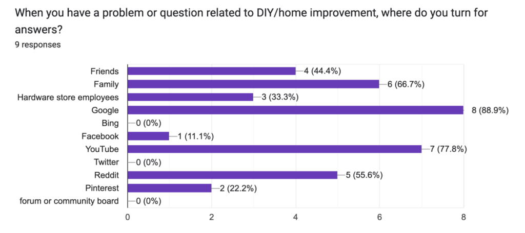
Survey respondents also indicated a propensity for gaining skills via video (specifically YouTube) as well as via community forums (Reddit). Based on these findings, video tutorials by request/popular vote will be included to enhance the knowledge base available on the platform.
Additionally, the basis of the product is a community engagement forum which allows users to post and have conversation around questions, demonstrations, and projects from registered users, novice and expert alike.
Information Hierarchy | Utilizing prominent post titles, a voting system, and comments impacts how users engage, prioritize, and interpret content.
Post Thumbnails | The accompanying preview image for posts allows users to interpret content at a glance, identify content of interest, ultimately improving engagement.
Accessibility Features | By prioritizing design choices with accessibility in mind (such as alt text for images and keyboard navigation support), we are able to ensure inclusivity and usability for all users.
Data Driven Design
Data: Designed and disseminated survey to collect quantitative data to determine features, understand user preferences, and tailor the experience according to needs and pain points.
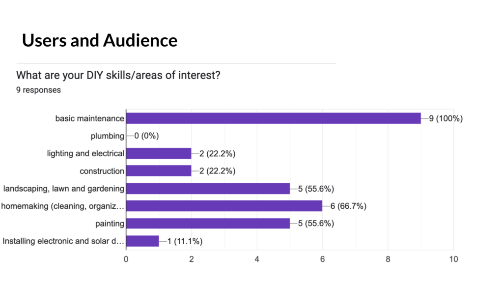
For this product, users cited an overwhelming desire to learn more about basic home maintenance, with a preference for in person 1:1 training. Based on these findings, I included an in-person workshop feature for experts to host events relevant to the community.
Data Driven Design Decisions
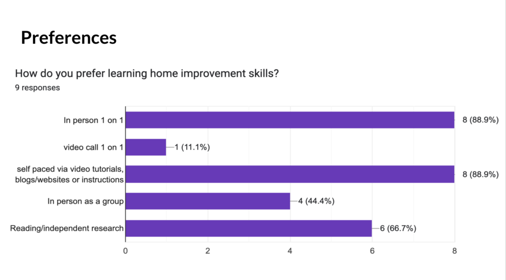
Given the majority of potential users surveyed had an overwhelming preference for learning 1-on-1, I included plans to build out a local contractor/expert booking page along with the community events option for in person meetups.
Research Methodologies
Given the abbreviated timeline to launch for the product, generating and hosting a survey was done to inform the direction of design and features necessary for MVP.
The data gathered from the survey aided in the design decisions based on demographics, behavior patterns, and preferences.
I also conducted a comparative analysis of 3 other platforms that focus on the intended demographic in order to ascertain what is currently missing from the market, differentiators, and successfully executed features, interfaces, and user flows.
Upon completion of the MVP, usability testing and additional iterating based on findings will be conducted.
Solution
The app is still in production, however it’s very promising. I was able to develop an app for users seeking to learn and connect with more experience DIYers and professionals.
The app will change the way people engage, form community, and approach projects more confidently with insights from experienced guidance.
Retrospective
Through this process I learned more about ux research, thinking through the user’s journey, and the importance of starting with the end in mind as it relates to what kind of data should be collected.
Engaging in this project allowed me to learn how data can be used to make better assumptions, and the challenge of building based on a single stakeholders perspective, when there are more involved. I was able to make calculated assumptions based on informal data collection methods and observations.
Without having conducted usability testing it’s challenging to state whether I was correct, however further iteration is planned for the future along with primary research.
Values And Beliefs
As a former social worker, luxury retail employee, and customer service rep, the basis of my decisions is always rooted in empathy. Being able to distill data and behaviors into unmet needs is a skill honed honestly.
My personal perspective and approach as it relates to design is to begin with the end in mind, focusing on how to deliver an uncomplicated and visually appealing project.
I value transparency, accessibility, and aesthetics. By prioritizing the look and feel of a project, I can craft an intuitive experience that creates an effortless interaction for users so that they can reach their intended goal, finding solutions and sharing information with other DIY enthusiasts of all levels.
Application to the Project
The intended goal of the project was to present a valuable resource for DIY enthusiasts of all levels seeking to connect, learn, share, and grow their skills. By focusing on providing an easily navigable platform, I can support their goals and fulfill the business requirement of a tool that fostered community and conversation.
In regards to accessibility, emphasis was placed on ensuring that color contrast meets WCAG AA standards at minimum following conventional standards. Video and audio accessibility via closed captioning will also be available once those features are introduced on the platform. Additionally, currently exploring options to promote the use of alt text for images uploaded in the feed and tutorial posts.
User Journey Insights
Outcome
What I would have changed:
- More intentional with survey questions with more consideration as to what happens / expectations after product is in the hands of the user.
- Surprised by number of apartment dwellers /non-homeowners interest in DIY
I would have liked to measure the desires and capabilities of potential users in the next age bracket to assert how best to move forward and validate factors for engagement.
Through this process I learned more about ux research, thinking through the user’s journey, and the importance of starting with the end in mind as it relates to what kind of data should be collected.